Portfolio / Renegade Nautical
Design test · Packaging redesign
Renegade Nautical
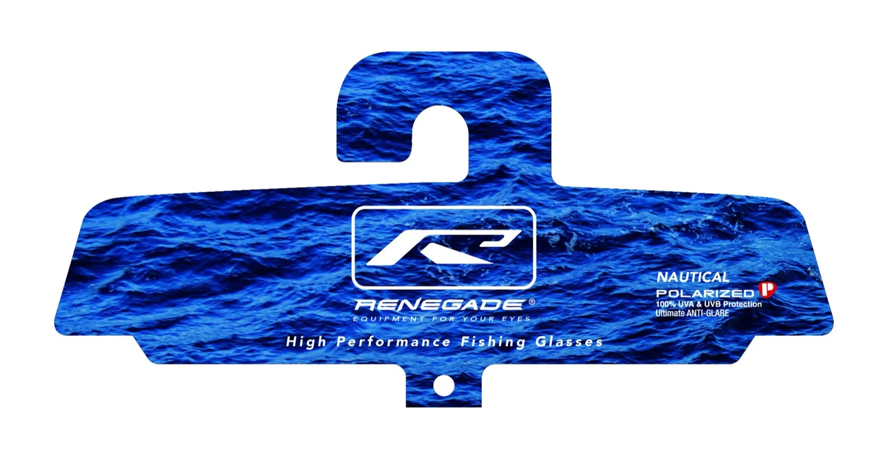
A packaging redesign for Renegade’s Nautical polarized fishing glasses: a retail J-hook card and a matching box, built around the water the lenses are made for.
Too much fighting for the hook
The existing card stacked a purple scale texture, a stock fishing photo and several typefaces. The logo, the product name and the polarized claim all competed for attention, and the purple didn’t say much about the water these glasses are built for.
The goal: keep every piece of required information, and make the card read in a glance from across the aisle.
Let the water do the selling
One image: the water
A single full-bleed water photo runs across every panel. It’s exactly where these glasses do their job: cutting the glare off the water.
Logo first
The Renegade mark goes white, centered and boxed, so the brand reads clearly from across the aisle on a peg.
Cleaner hierarchy
One white type system: logo and tagline, then the Nautical Polarized badge. On the back, the four benefits, contact info and legal label line up instead of floating. Every line of the original copy stays.
One family, two formats
The box carries the same system, so the card and the box look like they belong together on the shelf.
- Logo lockup and tagline on the lid and front
- The R mark and wordmark on both ends
- Benefits, contact info and the legal label on the bottom panel